About This Quiz
There's no denying that the U.S. is known for its car culture, and Americans are willing to shell out big bucks on their vehicles. At the start of 2018, the average new vehicle rang in around $36,700, and each U.S. household was spending an average of $9,000 per year on transportation costs.
Yet cars are so much more than the money we spend on them, or even a way to get from one place to another safely. Cars are ingrained into the very culture of American society. That's why slogans like "Built Ford Tough," or "Like a Rock" roll off the tongue so easily. It's why the site of a simple Chevy can remind you to "See the USA ... in your Chevrolet," or a trip in an old Honda can remind you of "The Power of Dreams."
Let's face it -- no one does marketing and branding like the automotive industry, and that advertising prowess doesn't end with vehicles. Sure, you can probably recognize many car logos without breaking a sweat, but you might be surprised to find out that that knowledge doesn't end with the cars themselves. Auxiliary industries and suppliers work just as hard as the car companies to make their products recognizable and memorable.
It's why certain gas station signs instill a sense of safety and trust, or why you feel comfortable spending hundreds on name brand tires, or a certain type of motor oil. Think you can identify popular car companies and auto-related brands using only their logos? Take our quiz to find out!
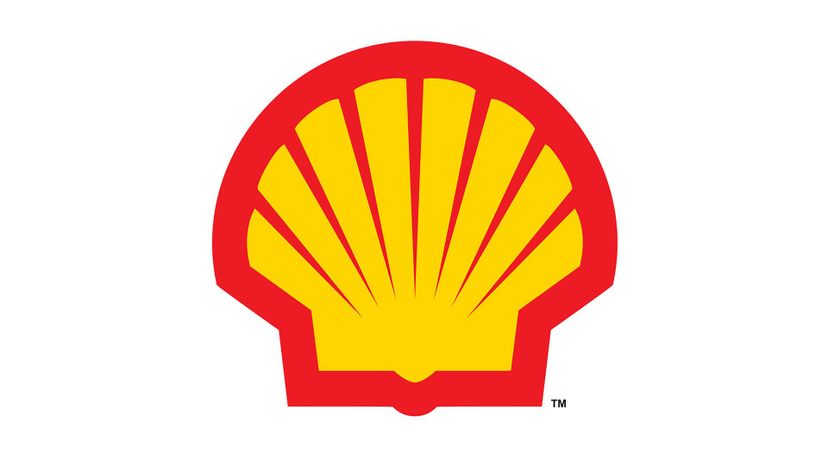
The first Shell logo used in the early 1900s resembled a basic mussel shell viewed from the top. By 1909 the company was using a black and white image of a scallop shell. It wasn't until 1948 that the shell was colored red and yellow.
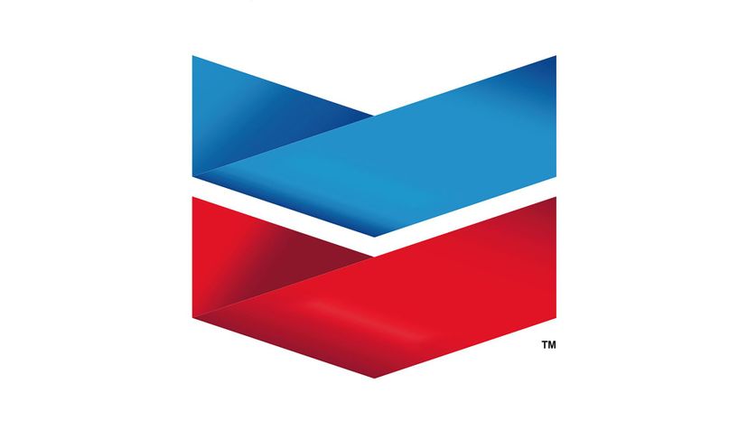
Chevron originally used a logo very different from the one you see today. It was a nature scene, showing the progress of industry in the form of wells, mines and smelting. When the company merged with Standard Oil in 1931, the V-shaped red, white and blue badge became its standard trademark.
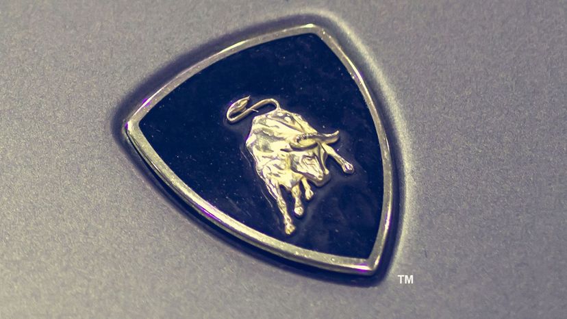
There's no mistaking the Lamborghini badge, with its luxe black and gold color scheme and charging bull logo. The image was inspired by company founder Ferrucio Lamborghini -- a Taurus -- who used the Zodiac to help him develop the perfect image for his new car company.
Advertisement
Valvoline has been selling petroleum-based lubricating oil since at least 1866. It wasn't until the '60s that the company started using its famous red and blue V logo, just in time to coincide with Valvoline's development of its VR1 racing oil.
Contrary to rumor, the BMW logo doesn't represent an airplane propeller. Instead, the blue and white pattern was inspired by the Bavarian flag. The company has relied on the same logo design since 1917 with only minimal changes since that time.
Armor All started in 1972 as a product called Trid-on -- that's "No Dirt" spelled backward. Today, the protective car treatment and car wash products are branded with a logo featuring a Viking armed with a mighty sword.
Advertisement
The Porsche logo, with its gold, black and red-orange coloring and rearing horse first appeared in 1952. The story of the logo is unknown, though Stuttgart, Germany --where the company was founded -- is known for its horse breeding legacy.
Luxury car company Cadillac has used at least three dozen logos since the early 20th century. All incorporate the coat of arms of La Sieur Antoine De La Mothe Cadillac, including a stretched-out version of the logo that debuted in 2014.
Japanese luxury automaker Infiniti has used the same logo since 1989. While some see a mountain peak, the upside-down V in the logo actually symbolizes the road stretching out ahead and into the horizon.
Advertisement
Fiat debuted in 1899 with an extremely elaborate logo -- its intricate edges resembled jigsaw puzzle pieces. Since then, the company has included its name within a variety of shapes to form its logo. All of these have one thing in common, however -- the A in Fiat has a distinctive shape.
The infamous Standard Oil was founded in 1870 by John D. Rockefeller. For years, the company used a red, white and blue logo with a central lighted torch as its logo. The lighted torch had a dual meaning -- showing the need for fuel to provide light, as well as metaphorically lighting the way to a brighter future.
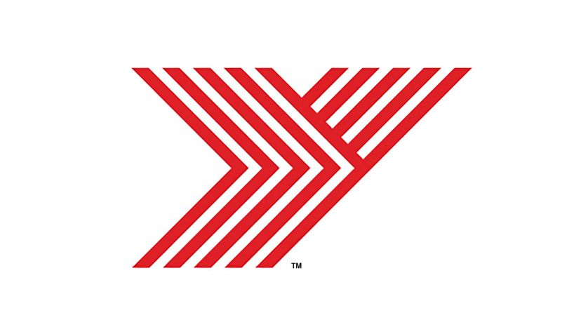
Yokohama Tires began as a partnership with B.F. Goodrich in 1917. Based in Tokyo, the company uses a giant red letter Y as its logo -- with the Y split into parallel lines to resemble the treads of a tire.
Advertisement
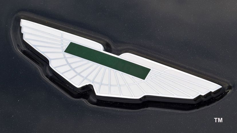
Aston Martin is well-known for its wings logo, which is smooth, subtle and refined. When the company began, however, it used an entirely different design -- the letters A and M intertwined within a circle.
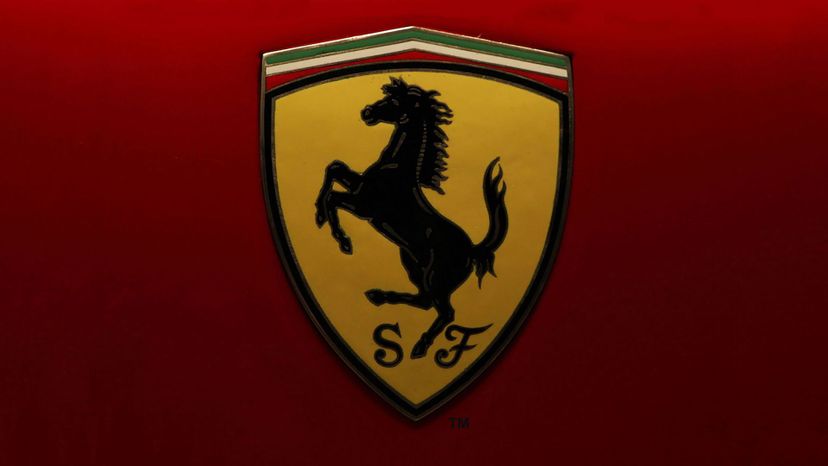
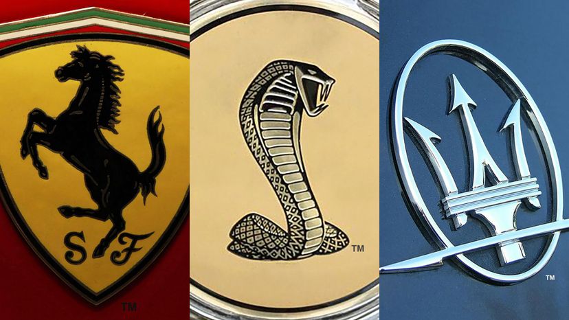
Ferrari first used its black horse logo way back in 1923. The story goes that Enzo Ferrari saw the design on the plane of a WWI fighter pilot. The pilot's mother suggested the logo would bring luck, so Ferrari elected to use it on his cars.
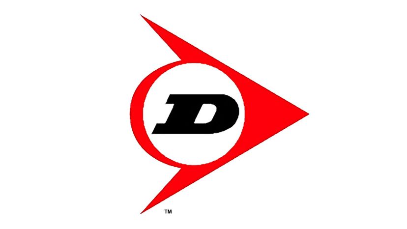
Dunlop started in 1896 when John Dunlop wanted to create a more comfortable bike riding experience for his child. The company's flying D logo was introduced in 1959, and now uses a red and black color scheme.
Advertisement
No, the T in the Tesla logo doesn't stand for the name of the company. In a 2012 tweet, Elon Musk confirmed that it actually represents a cross-section of the electric motor. The company itself, of course, is named for AC current genius Nikola Tesla.
Peugeot has used a lion in its logo since the company began in 1905. The first logo featured a lion walking across an arrow, while a simpler lion profile was introduced in 1948.
Alfieri Maserati founded his famous car company in Italy in 1914. For his logo, he chose a trident, which he plucked from the Fountain of Neptune in Bologna's Maggiore Plaza.
Advertisement
That winged horse from the Mobil gas logo is a Pegasus, and dates back to Greek mythology. According to legend, Pegasus emerged from Medusa's neck after her head was cut off by Perseus The logo dates back all the way to 1911. The merger of Mobil with Exxon was finalized on November 30, 1999.
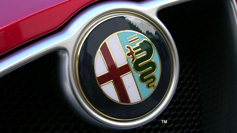
It's hard to find anything cooler than the Alfa Romeo logo. It consists of a red cross -- a symbol of the city of Milan -- and a man emerging from the jaws of a snake.
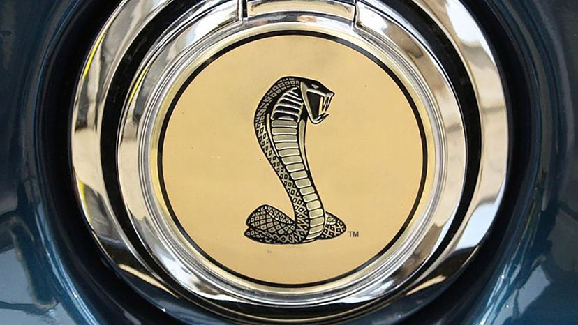
Carroll Shelby founded his car company in 1962 to create high-performance rides. Famous for models like the Shelby GT350 Mustang, the Shelby Dakota and Daytona, Shelby chose a wicked image of a cobra as his logo.
Advertisement
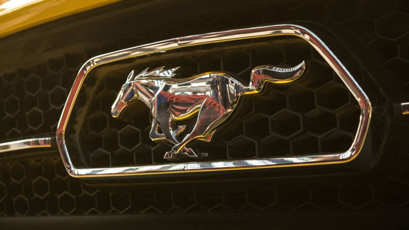
Ford has its own logos, but Mustang also has a unique emblem all its own. The running pony badge seem on the Mustang has been in use since 1964, and includes a red, white and blue background to emphasize that the pony car is All-American.
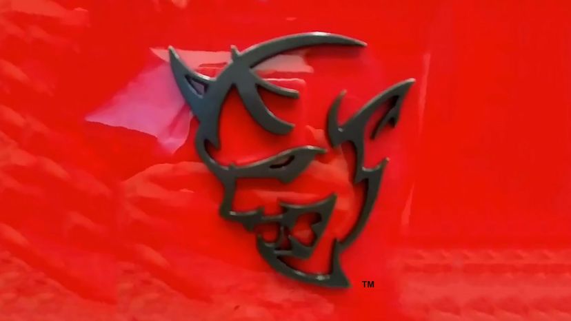
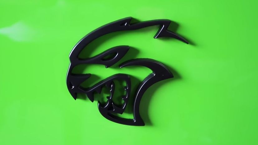
The Dodge Demon is a variant of the Dodge Challenger SRT Hellcat that came out in 2017. Its emblem is a truly wicked looking demon, complete with horns and fangs.
Rumor has it that the Chevy logo was inspired by wallpaper in a Paris hotel. Founder Billy Durant's wife later disputed that, claiming that the bowtie image came from an ad her husband saw in a newspaper while on vacation in Virginia in 1911.
Advertisement
Brothers Louis, Marcel and Fernand Renault started their iconic car company in 1900, using a scrolling combination of their initials as the logo. By 1925, the company had switched to the classic diamond-shaped logo they still use today.
Sinclair Oil set up an educational dino-based display at the 1933 World's Fair in Chicago. It was so popular that the company started using a dinosaur -- a brontosaurus to be specific -- as its mascot for gas stations, hotels and refineries.
The Impala has an emblem of its own beyond the traditional Chevy logo. Because it's named for an African antelope -- or Impala -- the brand uses an image of this creature as part of the branding for this model.
Advertisement
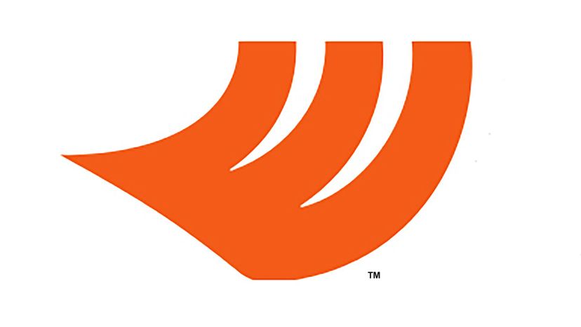
Hankook is a Seoul-based tire company whose name translates to "Korean Tires." Since 2004, the brand has used an orange stylized tire logo -- which appears to be taking flight or sprouting wings -- to represent its products.
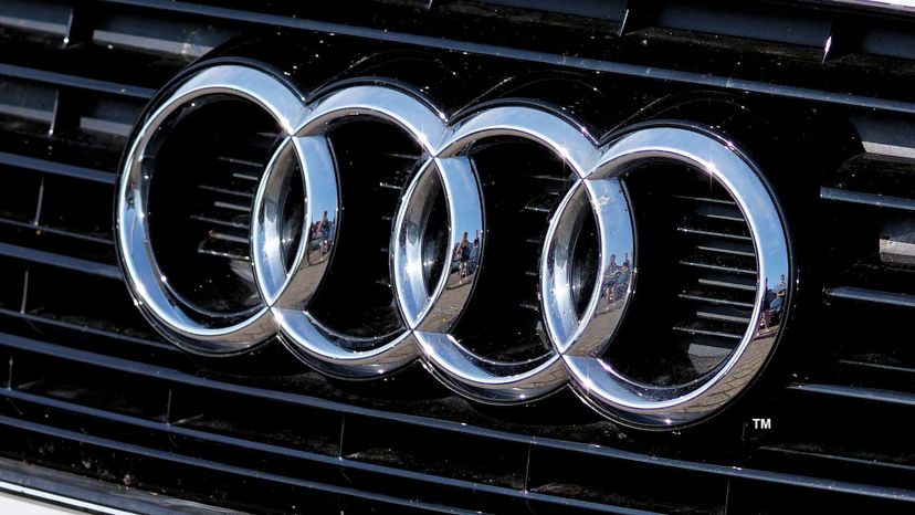
Audi got its start in 1932, when four German auto companies joined forces. In 1985, the company adopted its four rings logo, with each of the rings representing one of these original four companies.
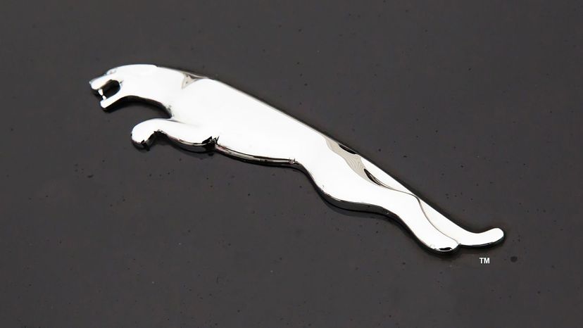
In the 1920s and '30s, Jaguar cars were sold under the name Standard-Swallow, with a bold "SS" logo. After WWII, the whole concept of anything associated with the SS fell out of favor, so the company switched to the familiar jaguar you see today.
Advertisement
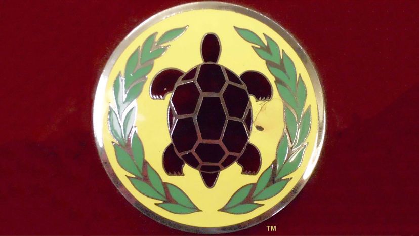
Gordon-Keeble was a British car company that made grand touring vehicles in the '60s. When a turtle wandered into the scene during a company photo shoot one day, management decided that a turtle would be the perfect logo for the brand. Maybe that's why they haven't been all that successful.
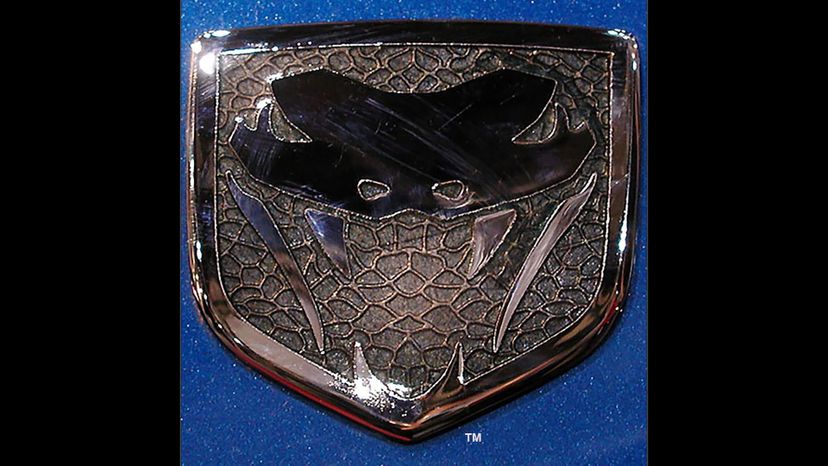
Dodge has been producing its iconic Viper sports car since 1991. Every edition has gotten its own version of the model's snake emblem, including drafts known as Sneaky Pete, Fangs and Stryker.
Toyota has used a trio of overlapping ellipses as its logo since 1990. According to the company's website, the interlocking shapes represent the unification of the company and its customers, while the blank space represents room for future improvement.
Advertisement
The Bosch logo is world famous, but might not make much sense to you if you don't have a scientific mind. Bosch invented an early electric ignition source known as a magneto. The shape of the Bosch logo comes from a part of the magneto known as the armature.
Soichiro Honda started his famous car company in 1948. Ever since then, the company has used a sturdy letter H as its logo.
Souped-up versions of the Dodge Charger and Challenger SRT are sold under the Hellcat name. The logo shows an aggressive feline, and the name comes from a group of Navy fighter pilots in WWII.
Advertisement
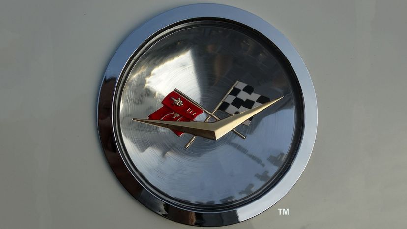
The Chevy Corvette has its own emblem, in additional to the traditional Chevy bowtie. It consists of a pair of crossed flags. One of the flags is checkered, while the other is generally marked with a fleur de lis from the family crest of Louis Chevrolet.
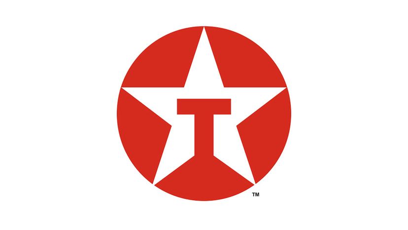
Texaco began as The Texas Company in 1901, eventually merging with Chevron in 2007. Its logo consists of a red circle with a white star inside -- which represents the Lone Star State of Texas.
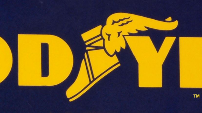
That winged foot represents the Goodyear Tire Company. Founder Frank Seiberling had a statue of the Roman god Mercury in his home. Inspired by the statue and its winged feet, he proposed the image as the logo for his new company in 1900.
Advertisement
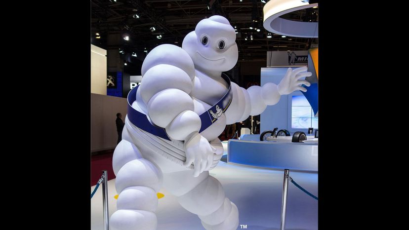
Believe it or not, the marshmallowy Michelin man has a name. It's Bibendum, and he's one of the oldest trademarks in the world. The idea for this logo came from the Michelin brothers, who designed the famous image in 1894, inspired by a stack of tires that resembled a man without arms.