About This Quiz
Why change a logo when it's so well recognized? When reviewing the type font and colors chosen, an old logo can indicate old-fashioned thinking - not progressive or innovative. Your favorite brand manufacturer knows how important impressions can be and will put a lot of money toward their business symbol, the logo. But it's not just the font chosen that is important. There are colors and symbols to consider as well. It's not easy, especially when fashion changes so quickly. For instance, colors that were trending for a minute, let's say avocado, can look outdated now.Â
Another hurdle is that viewers' attention-spans top out after about three seconds. That means it's important to use simple, clear graphics and strong colors to get the most brand recognition for the buck. Designers who create these logos also recognize the importance of how big and how small the logo might be on a product. If the company has a long name, the logo can be difficult to use on a button or imprinted on merchandise and still be readable.Â
So take a good look at the original logos and appreciate what these brand logos look like today. Take the quiz now - if you're a consumer, you've got this!Â
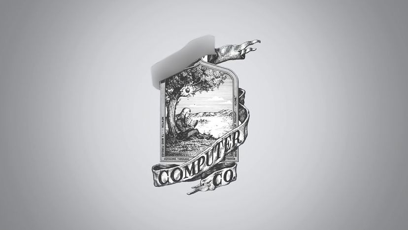
Although an apple a day will keep the doctor away, This Apple gives you the power to connect to the internet and more. As with all its products, the company has simplified their look today, as well as their logo.
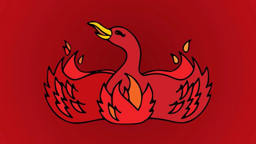
Similar to Apple® in that it deals with the internet, Mozilla Firebox is a platform you can use to surf the web. Someone realized that the name "fox" should be reflected in the logo.
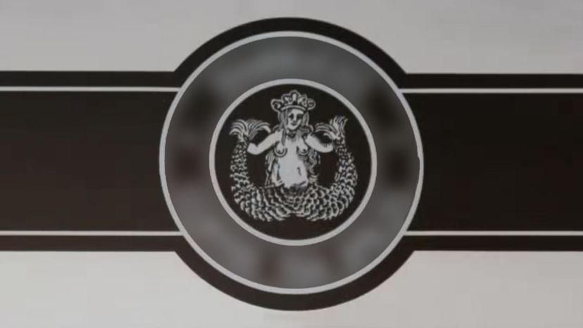
Does the smell of coffee feel like a siren (half woman, half bird), calling you? Well that's the creature from Greek mythology depicted with two tails or two wings, summoning you for your morning latte.
Advertisement
Walt Disney is the creator of the company, Disney. This name now includes, movies, cartoons, merchandise, world-wide amusement parks, and so much more.
Have a question? Google it. This is one of today's top companies, and the logo hasn't changed much over the years - just a fresher type front.
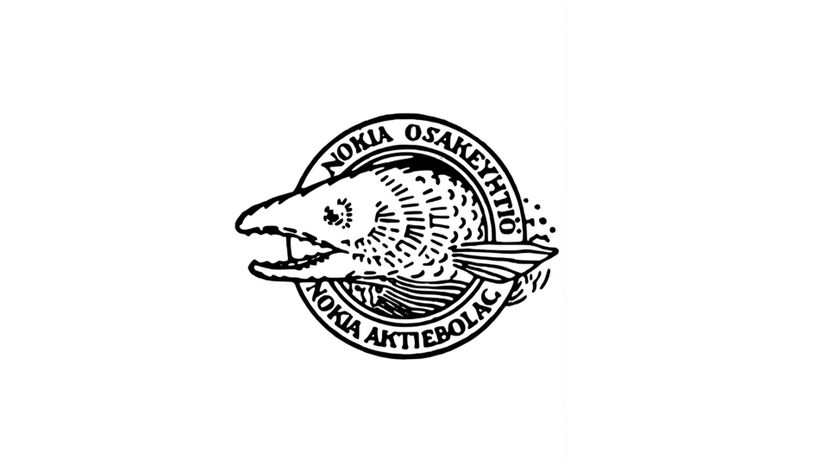
Nokia's first logo, designed in 1871, when Nokia was based in Nokai, Finland. At that time the company was manufacturing paper!
Advertisement
You may have played with these as a kid, or you know children that play with them. The Lego Group began in the workshop of Ole Kirk Christiansen (1891-1958), a carpenter from Billund, Denmark, and his business will continue for years to come.
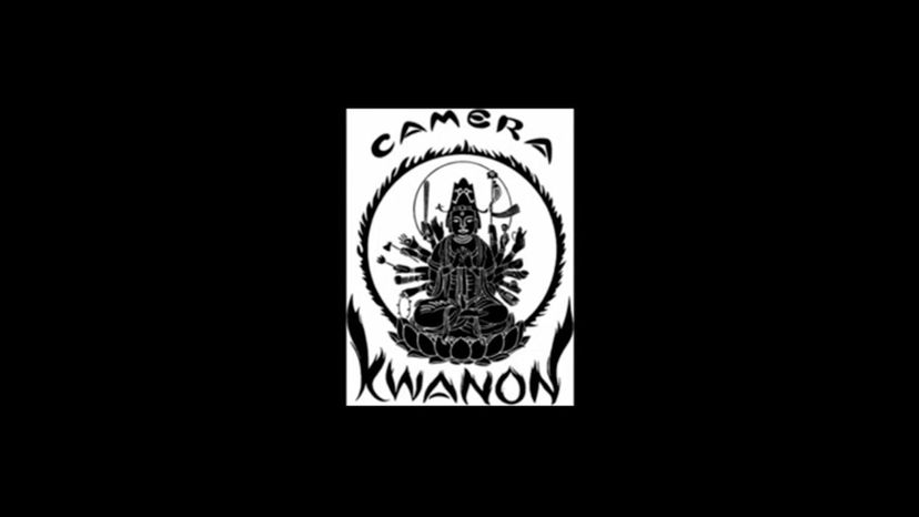
The company was named, Kwanon after the Buddhist Goddess of Mercy. This Goddess was the possessor of thousand arms and spitted flames. When bringing its products to the world, the company came up with a more forward-looking logo.

When Amazon first started, it was only an online bookseller. That's why under the old logo's translucent "A†were the words "Amazon.com, Earth's biggest bookstore.â€
Advertisement

Since their start in 1889, the logo consisted of the company name in kanji. It is believed to mean, "leave luck to heaven.†However, there are other opinions regarding the thoughts of the founders at that time.
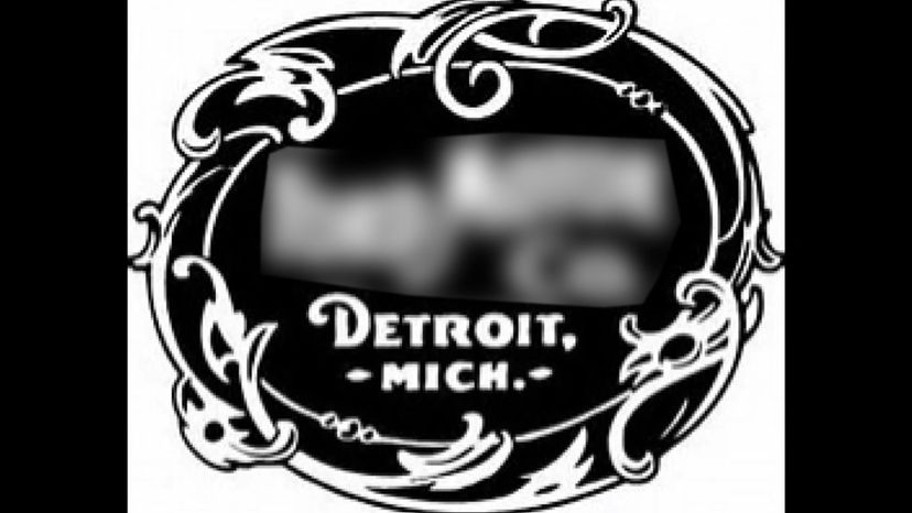
The very first Ford logo was much different from today's. It contained a circle (now an oval) with a fashionable art nouveau border. It carried the entire name of the company.
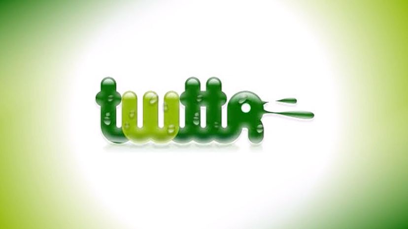
If you can turn your logo into a bird without any words around it, you are a well-known company. The colors also changed from green to sky blue.
Advertisement
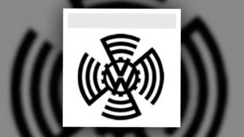
The company's most famous car is the VW Beetle. This logo started out complicated, but today it is a simplified version.
From getting the world to sing about Coca-Cola, this company has always updated itself to remain as relevant as possible in countries across the world. The old logo was black typeface, but in today's logo the color red is highly associated with it.

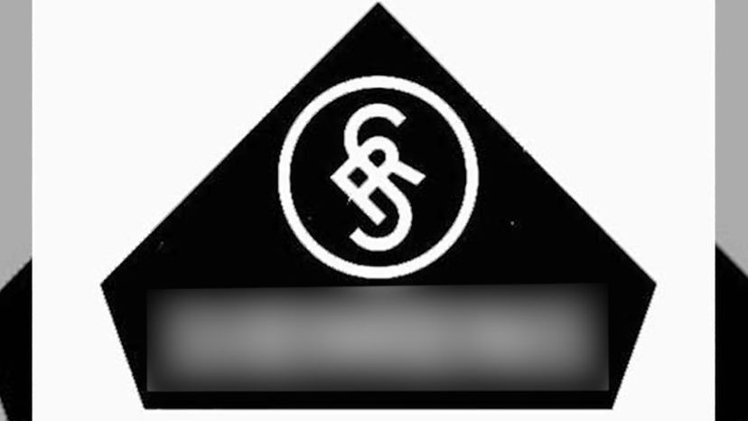
In 1921 two brothers wanted to provide equipment for the then-nascent field of amateur, or ham, radio. They chose the name "Radio Shack." The name has stayed the same, but the type face and use of the "circle R" have changed with the times.
Advertisement
This playful little logo is from the Playboy Club. As you can see, the logo was simplified into a bunny head and made more masculine looking with the bow tie and black-and-white choice of colors.
Here is another company who simplified their logo since it was first launched in 1981. The original logo, a gloved hand holding a musical note popping out of the letters "MTV" has been transformed to a rockin' "M" with a funky "TV."
It's a good thing the original logo isn't being used today - the floating head of Colonel Sanders is a little unappetizing. Today's logo is sleek and strong, using "KFC" instead of the long cumbersome name, and Colonel Sanders has a neck and shoulders.
Advertisement
In the original logo, the company used a flat representation for the world. In the latest version, there is a globe, cleaner lettering and eye-pleasing kerning (the spacing between letters) to give it a contemporary flair.
The original Shell logo appeared in the early 1900s and was a poor drawing of a mussel shell. Once the scalloped shell replaced it, the logo became much stronger and sleeker, with bright red and yellow brought in to accent the logo.
Microsoft changed logos a few times, the original 1978 design used the cool type font of the times, and then dropped it in 1987 and used a dark green background. Today's logo is angled forward, as in accelerating, and has a clean, easy-to-read type face.
Advertisement
All you need to recognize this logo today is a single curved line that goes thicker at one end. This swoosh was incorporated in the first logo, along with the name.
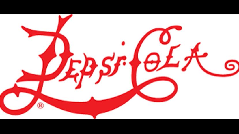
Pepsi's original logo was red script on white. They swapped the fancy script for clean black lettering in 1962. Introduced in 1972 , the bottlecap stylized circle had many iterations up until today, where the striped circle stands alone as Pepsi's logo.
The original 1962 logo was simply the brand name in a font that was available to its printer. There have been various versions throughout the years until 2008, which was when they included its company tagline as well as placed a yellow star-like symbol on the side of its name.
Advertisement
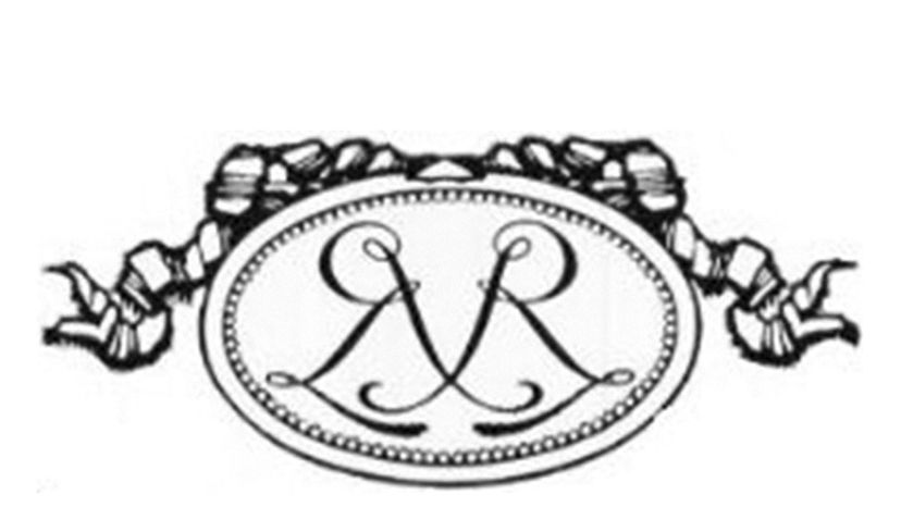
Renault's logo began as a medallion with the founders' initials in 1900. There were other versions until 1925, when Renault displayed the diamond shape logo. The signature yellow color was added to the logo in 1946.
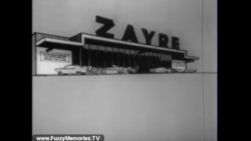
Zayre was a chain of discount stores that operated in the eastern half of the United States from 1956 to 1990. The logo used red, black and white with a clean, crisp type face. It also sometimes contained a red flower-like design next to the "Z".
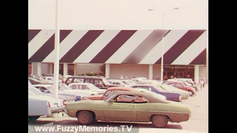
Venture Stores, Inc., was a chain of retail stores aimed at the discount department store market. Although now defunct, you may recognize the zebra striping that went along with its name.
Advertisement
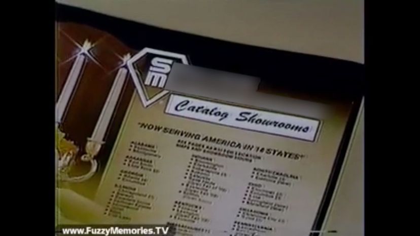
Bringing catalogs and showrooms together, Service Merchandise had a good run for 68 years (from 1934 to 2002). This retailer chain had one of everything, including fine jewelry, toys, sporting goods and electronics.
Siemens original logo in 1899 combined the "S" and "H," which were the initials of its founders - Siemens and Halske. When the company was renamed as Siemens AG, the logo changed. The latest update in 1991 contains the cyan-colored "SIEMENS" typeface.
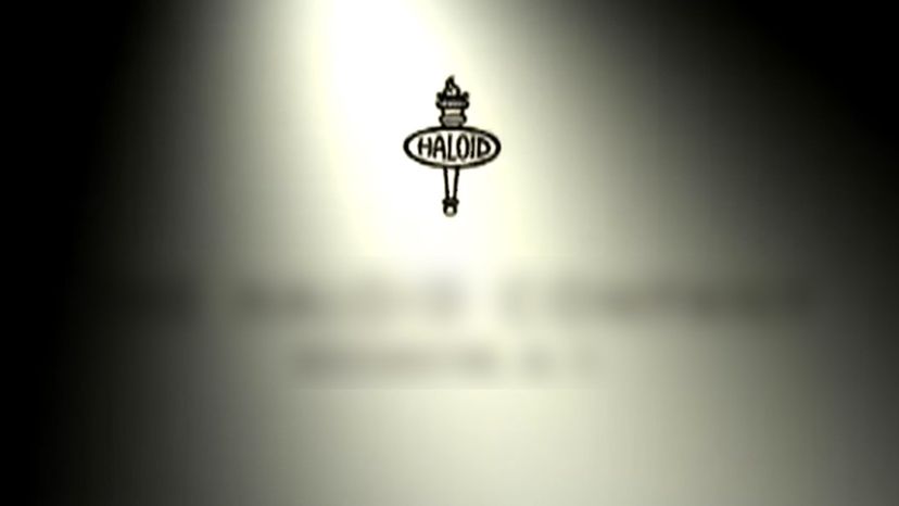
In 1937 the company was known as Haloid Company, but the name was changed in 1961 when its best-selling printer, the Haloid Xerox 914, was remembered more than the company name. Since then, the Xerox typeface became the only feature of the logo until 2008, when a red ball symbol with the white letter ‘X' on it was added.
Advertisement
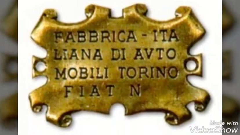
Fiat's first logo was an unappealing brown leather patch that contained company information. It was only two years later, in 1901, that Fiat came up with a proper logo. Although there were many iterations over the years, the tilted letter "A" is present in most of them.
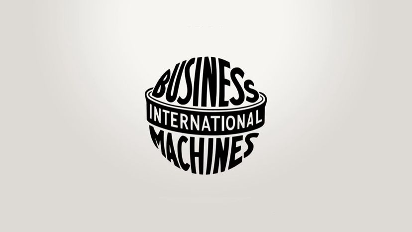
When International Time Recording Company and Computing Scale Company merged in 1911, the first IBM logo was created. It was not until 1947 that IBM created its well-known typeface logo. Since 1972, IBM blue horizontally-striped logo has remained as is.
What does LG stand for? It's a merger of Lucky and GoldStar companies. In 1995, this company changed its name to LG Electronics and included the company tagline ‘Life's Good' in it's present-day logo.
Advertisement
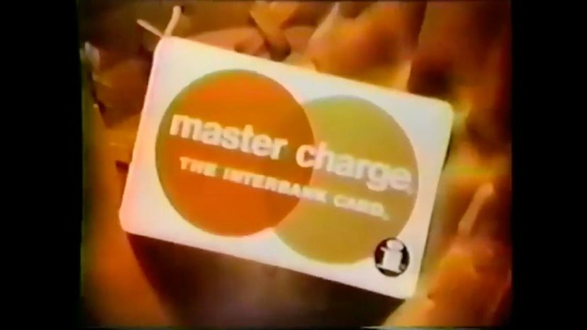
Looking at the 1966 logo, it is hard to imagine it became the MasterCard logo we know today. MasterCard used to be known as Interbank in 1966. The "Interbank/Master Charge" was renamed "MasterCard" in 1979. Subsequently, a logo was created with two overlapping red and orange circles and the name "MasterCard" added.
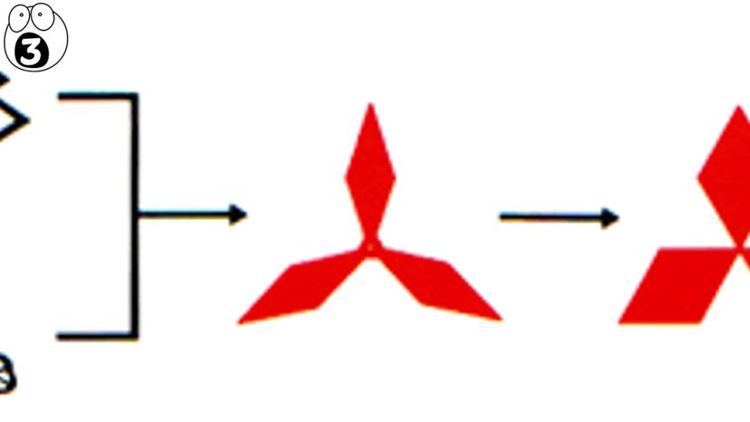
The first logo of Mitsubishi was derived from a combination of two age-old Japanese family crests in 1875. The logo was updated in 1964 to thicken each diamond shape. The latest logo update includes the word 'Mitsubishi' and its tagline.
In the original logo and all other variations, the Peugeot lion has been a constant symbol. The most significant change was the addition of the blue background to the logo in 1998.
Advertisement
Palm was founded in 1992, when it was known as Palm Computing. The logo was a simple dotted ‘P' on five horizontal lines. The company, now know as 'Palm", has a circular orange logo.
Created around 1900, this design was originally made to be a symbol for the center of one of the first electric fans. In 2004, together with the introduction of the new corporate color blue, the new, easier-to-read logo was designed.
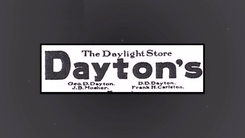
If you know your history of buyouts, mergers and name changes, you might recognize the Dayton's logo as Target. Dayton Hudson changed its name to Target in the year 2000.
Advertisement
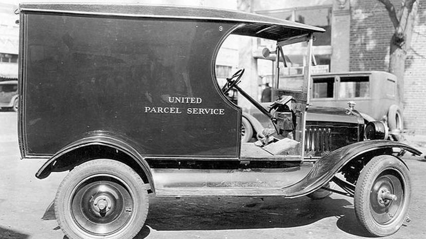
The Eagle and Shield was the very first UPS logo, created in 1916 by the founder of UPS. The logo also had the words "Swift, safe and sure†as a description of their services.