About This Quiz
Are you brand-conscious? Do you have brand loyalty? Then we're sure it will be very easy for you to ace this quiz!
Brands have their famous logos, of course. And these logos are designed in a way that will represent a brand's image, integrity, and identity. But more than that, these logos also stand for the company's ideals, values, and principles. Yes, that might sound like such a huge deal to put in a "simple" logo design, but it's actually not.
See, the logo is what will represent the company and its specific brand. If they're not represented well, then it will be such a waste to have people remember their name only. The graphics will always be an added attraction and visual for people to remember them by. People are mostly visual in thinking. That's why branding like this works. And the most popular and successful companies know this, all too well.
Thus, it's no surprise that in designing the logo, the color has to be decided as well. Colors come with their own psychology and emotion, therefore it is necessary to have people feel something whenever they see such brand logos.
So, are you familiar with the colors of these very popular world brand logos? Then take the quiz and (color) chart away!
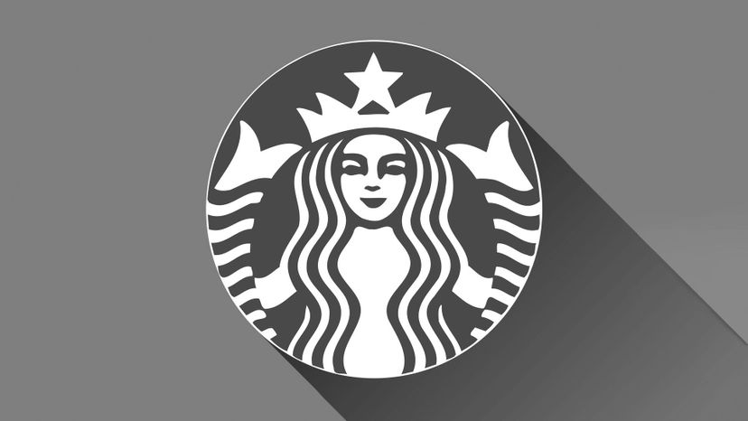
Starbucks has an unforgettable image for a brand logo. It's in green.
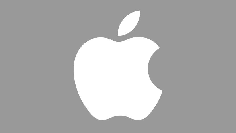
Apple's iconic logo with a bite is usually depicted in white. Simple but elegant -- and yeah, a bit naughty with that bite!
Coke is it! Especially with that distinct red logo, you can't miss it.
Advertisement
The FedEx logo carries the purple and orange combo.

FB's unmistakable blue logo is familiar around the world. They also hijacked the thumbs up icon and made it into their own "like" concept.

Shell is a legendary oil company that used a seashell for its logo. Shading it in yellow with a red outline was also a good idea.
Advertisement
Dunkin' Donuts is memorable with its orange and pink logo.

A secondary color is a mix of two primary colors. It's green, in this case.
Samsung's blue logo is a simple graphics design. Blue and white are its colors.
Advertisement
The famed Golden Arches of McDonald's are actually yellow. But perhaps "golden" sounds more stellar.
Pepsi's red, white and blue colors of their iconic logo help with brand loyalty. No matter how they jazz it up, people still recognize it.
Rolex uses gold to shade its crown in the logo. It's supposed to symbolize high status and wealth, which is what you need to afford one of their watches.
Advertisement

Red, yellow, and blue shade Google's logo. It's very recognizable.
Purple and red are but two of the colors in the NBC logo. Purple symbolized the stations and red symbolizes the entertainment division.
Levi has an unmistakable red tab. It has been red since the logo's inception.
Advertisement
Mastercard's red and yellow circle logos are recognized worldwide. Those behind in their credit card payments may develop an allergic reaction to it, though...
The Lacoste logo has interchangeable colors, depending on what the brand is doing. But the crocodile is green.
NatGeo's trademark magazine cover border is shaded yellow. This eventually became the logo the company used in other media, like in TV.
Advertisement
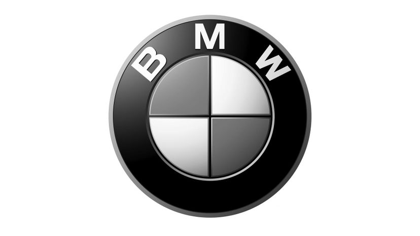
The BMW logo has two blue and two white quadrants. It's supposed to symbolize the Free State of Bavaria, which is a part of Germany.

Amazon goes by two colors: orange and black. These corporate colors are, of course, reflected in the company's logo.
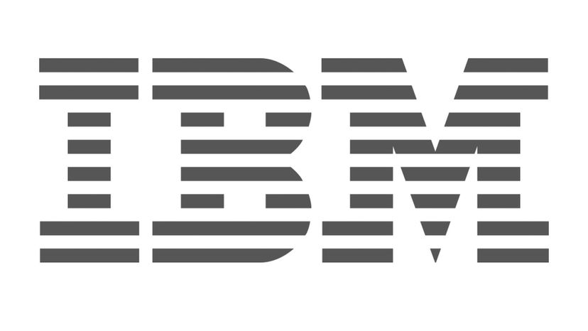
IBM's blue is supposed to represent professionalism. Don't feel blue in the corporate world, though...
Advertisement
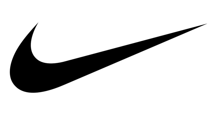
In 2017, Nike decided to shade its swoosh logo in black. Before that, it was usually red or white.

That cute Android robot logo is green. It's not cute when you can't see it because of technical difficulties, though.

Twitter's bird logo is blue. Although in other uses, it also appears in white.
Advertisement
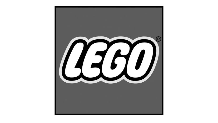
Black and yellow outlines encase the word "Lego." The letters are white.
Ford's company logo is blue. But it's somewhat mixed in with some white to give it a smoother effect.
Baskin Robbins may have 31 flavors, but its logo only has three colors. They are blue, pink, and white.
Advertisement
Ferrari's black horse in its logo is framed by the very yellow coat of arms. It's a striking color for a luxury car brand.
The 7-Eleven logo has green in it. But did you notice that the "n" is not capitalized like the rest of the letters?
CNN's red logo is supposed to symbolize passion. That passion is applied to the network's pursuit of truth in journalism.
Advertisement
The BK buns are yellow. It's a cute image play to the burger product.
The "o" in Mobil is red. The rest of the letters are blue.
The apple is red. But is it juicy?
Advertisement
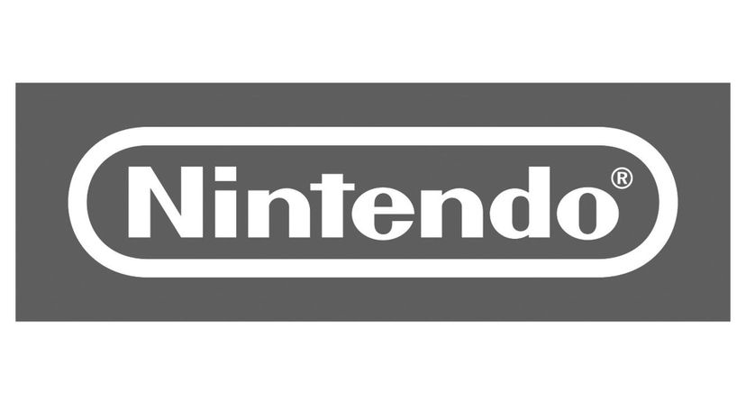
The Nintendo logotype is a simple red. But it's the kind of simplicity that works.
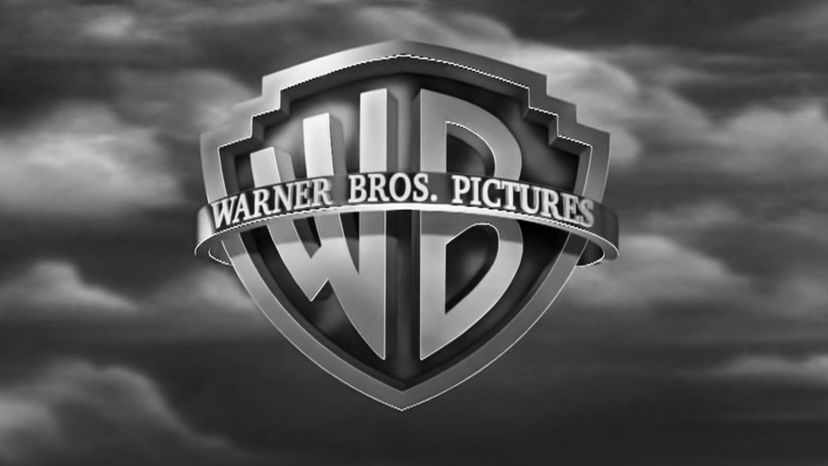
The Warner Bros. logo has evolved over time. Its inner shield is now blue.
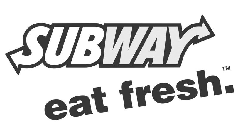
Subway recently reworked its logo, and the color shading as well. There's still green in it, however, like the veggies that are found in their subs.
Advertisement
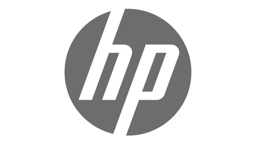
The Hewlett-Packard logo comes in an elegant shade of blue.
Visa's gold and blue logo is there to remind you of the company's origins. The gold color is supposed to symbolize the golden hills where its bank was first founded.

That yellow asterisk in Walmart's logo is not a punctuation mark. It's supposed to symbolize a flower.
Advertisement